Sunday, September 30, 2012

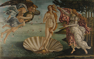
Formal Analysis of The Birth of Venus


Botticelli's The Birth of Venus
Image from Wiki Commons

The focal point of Botticelli’s The Birth of Venus is Venus herself, almost floating, in the center of the foreground with stark white skin; beams of light hitting her carefully painted curves. She is joined by Zephyrus, the wind God, his wife, Chloris, goddess of flowers, and the the nymph, Pomona, ready to receive Venus with a robe. Venus’ abnormally large proportions draw the eye of the viewer. With the curvature of her receivers, Venus is enclosed in an ovular shape, bringing unity to the piece. The expression on her face, as well as her pink hue, emphasise a youthfulness that reveals that she is emerging from the sea for the first time. To further her apparent modesty, Botticelli paints Venus covering herself with her arms and hair. The movement of Pomona’s garb depicts movement, as though she is running toward Venus to cover her and maintain her child-like modesty. Although Sephyrus is blowing the wind toward Venus, as if to beckon her, his robes blow in the opposite direction to further the importance of Venus’ arrival. Botticelli clearly uses line to his advantage in this piece. The implied line of the wind creates an overwhelming sense of movement. The detailed lines in Venus’ hair show her feminine structure. The background lay flat against the canvas, thus bringing all of the attention to the foreground. The most depth in the painting lies in the detailing of Venus’ body-- the definition in her stomach, face and hair. Another design element that Botticelli elegantly uses in this piece is color. The background is dark-- the sky looks as though a storm is coming; however, the foreground is brightened by a sun beam coming in from the right side of the painting, bringing a lightness and happiness to the painting. Botticelli’s The Birth of Venus illustrates articulate use line, color and expression.

Sunday, September 23, 2012

Principals of Design


Photo by Georgia Button 


The Ponte Vecchio, designed by Taddeo Gaddi, arches over Florence’s Arno River at its narrowest point. Initially, bridge storefronts were utilized by butchers; however, over time, and through natural deconstruction and reconstruction, it has become a treasure trove full of equal numbers of jewels and tourists. It is believed to have been built in Roman times and most recently reconstructed in 1345, making it the oldest bridge in Florence.

Unity and Variety: The mechanical aspect of the bridge is quite linear and rhythmic; it consists of three arches, the center arch slightly longer than its neighboring arches. The variety exists in the extended structures. The functional portion of the bridge is what maintains unity.

Balance: The Ponte Vecchio is unique in that it does not maintain the same symmetrical balance of Florence’s architecture that shares a similar date. What makes the Ponte Vecchio so unique is its protruding structures. Small storefronts extend out over the Arno River with no particular pattern. Sparsely placed, these structures make the bridge as a whole look unfinished, but beautiful in its unique off-balanced balance.

Emphasis and Focal Point: The varied colors of the protruding structures make them the focal point of the asymmetrical bridge.

Rhythm: The mechanical aspect of the bridge is quite linear and rhythmic; it consists of three arches, the center arch slightly longer than its neighboring arches. Fourteen windows are equally distanced from each other along the top.

Scale: The Ponte Vecchio is modest in its scale compared to other monuments of its time. Its size is naturally fitting to its surrounding buildings; however, its proportions seem out of balance...

Proportion: Proportions are unique to European style: modest and small portions extending out from a bridge barely wide enough for two cars to pass each other. Each storefront is so small that they are out of proportion with the rest of the larger tourist shopping areas surrounding the Ponte Vecchio.

Sunday, September 16, 2012

Elements of Art


Elements of Art: Shape/ Form
Masolino da Panicale, San Giuliano (c. 1420)
Luca Signorelli, Madonna and Child (c. 1490)


Masolino da Panicale and Luca Signorelli share a similar understanding of human form. In Panicale’s painting, San Giuliano, and Signorelli’s Madonna and child, they illustrate a comparable knowledge of shape and expression. Although they are both pieces created during the Renaissance, they date at c. 1420 and c. 1490; 70 years apart. They still hold strikingly similar shapes in regard to anatomy and angles. Both figures are painted at three quarter profiles and have bone structures that resemble each other. Panicale and Signorelli show the shapes of their subjects’ bodies underneath a heavy layer of clothing. Signorelli’s Madonna has a bulkier frame; her shape gives the impression of a sturdy woman. Conversly, Panicale’s San Giuliano has a more frail form, as he stands alone, centered, without strong footing. The shape of San Giuliano is also much more rigid, as a posing figure, whereas the Madonna is a fluid image almost captured in motion while playing with her Son. In these two works, the captured human form shows relationship, understanding of anatomy and emotion.