Wednesday, November 28, 2012

Logistics and Aesthetics of Ponte Vecchio

Ponte Vecchio, Florence, Italy
Photo from Wiki Commons


The Ponte Vecchio is unique in that it does not maintain the same symmetrical balance of Florence’s architecture that shares a similar date. What makes the Ponte Vecchio so unique is its protruding structures. Small storefronts extend out over the Arno River with no particular pattern. Sparsely placed, these structures make the bridge, as a whole, look unfinished, but beautiful in its unique off-balanced unity. “You could call Ponte Vecchio a pasticcio, a mish-mash, or at least an arrangement of contradictory architectural notes" (Pridmore). The varied colors of the protruding structures make them the focal point of the asymmetrical bridge. The mechanical aspect of the bridge is quite linear and rhythmic; it consists of three arches, the center arch slightly longer than its neighboring arches. The variety exists in the extended structures. The functional portion of the bridge is what maintains unity. “Ponte Vecchio's architecture of countless fragments reflects this city's incalculable memory or, more simply, its lovely imperfections touch deep emotions" (Pridmore). 


Essay by Georgia Button and Kate Logue.


Bibliography

Pridmore, Jay. "Ponte Vecchio, a Bridge That Spans Centuries." The Wall Street 
     Journal: n. pag. Web. 28 Nov. 2012. <http://online.wsj.com/article/ 
     SB10001424052748704717004575268933589711578.html>. 

This article from the Wall Street Journal: Europe Edition gives a brief overview of the history and architecture of the Ponte Vecchio, discussing its form as well as its function. 

 The Earliest Guide to Florentine Architecture, 1423. Florence: 
     Kunsthistorisches Institut, 1969. JSTOR. Web. 28 Nov. 2012. 
     <http://www.jstor.org/stable/10.2307/27652221>. 

This book, found on JSTOR, covers Florentine Architecture and features a small but informative section about the Ponte Vecchio, utilizing primary sources and scholarly information. 

History of "The Oldest Bridge in Florence"

Ponte Vecchio, Florence, Italy
Photo from Wiki Commons


The Ponte Vecchio, designed by Taddeo Gaddi, arches over Florence’s Arno River at its narrowest point. Initially, bridge storefronts were utilized by butchers; however, over time, and through natural destruction and reconstruction, it has become a treasure trove full of equal numbers of jewels and tourists. “The version preceding the present one was completed around 1200. Remembered for its five high arches and "camel back" profile, it became the old bridge as several new ones went up shortly afterward to serve a population of 100,000” (Pridmore). This has garnered the bridge a reputation of status and antique appeal for locals and tourists. The proportions are fitting to the unique historic European style: modest and small portions extending out from a bridge, barely wide enough for two cars to pass each other. Each storefront is so small that they are out of proportion with the rest of the larger tourist shopping areas surrounding the Ponte Vecchio that have been built more recently and on a slightly larger scale. Further, the Ponte Vecchio is not only a destination for its own beauty; Dati points out that, “shops on both sides make it seem not a bridge, except at the center where there is a piazza with parapets, which show off the river above and below... In this case he is pointing out a view of nature, the river, as it is heightened by a man-made frame" (The Earliest Guide). The Ponte Vecchio not only stands in beauty itself, but guides the eye to the natural beauty of Florence. 


Essay by Georgia Button and Kate Logue 


Bibliography


Pridmore, Jay. "Ponte Vecchio, a Bridge That Spans Centuries." The Wall Street 
     Journal: n. pag. Web. 28 Nov. 2012. <http://online.wsj.com/article/ 
     SB10001424052748704717004575268933589711578.html>. 

This article from the Wall Street Journal: Europe Edition gives a brief overview of the history and architecture of the Ponte Vecchio, discussing its form as well as its function. 

 The Earliest Guide to Florentine Architecture, 1423. Florence: 
     Kunsthistorisches Institut, 1969. JSTOR. Web. 28 Nov. 2012. 
     <http://www.jstor.org/stable/10.2307/27652221>. 

This book, found on JSTOR, covers Florentine Architecture and features a small but informative section about the Ponte Vecchio, utilizing primary sources and scholarly information. 

FAST FACTS


Panorama of Ponte Vecchio
Photo from Wiki Commons

• The Ponte Vecchio is a Medieval bridge that spans the Arno River in Florence, Italy


• Giorgio Vasari claimed that Taddeo Gaddi was the architect of the bridge

• It was first constructed in the Roman Era, and first documented around 960CE.

• It has been destroyed twice by floods: first in 1117CE, then in 1333CE. Today the architecture remains intact from 1345.
• The Ponte Vecchio is a segmental stone arch bridge, consisting of three segmental arches
• The longest arch spans 30 meters, and the two shorter arches span 27 meters
• The Ponte Vecchio serves many practical purposes: a way to cross the Arno River, and it is home to many jewelry shops
• Traditionally, the Ponte Vecchio has always been home to shops and merchants. It used to have butchers and meat shops, but then transitioned to jewelers.
• The Ponte Vecchio is the only bridge in Florence to survive the bombing that occurred during WWII.


Post by Georgia Button and Kate Logue.

Wednesday, November 21, 2012

Renaissance Sculpture


The Cross-Legged Captive (c. 1530-1535) is a carved marble piece by Michelangelo. It stands in the Galleria dell’Accedemia in Florence, Italy. Michelangelo is known for his work in carving. Marble carving can be done by hand or with tools. Artists manipulate a pliable material into a three dimensional shape. The drawback is that once, a chunk has been chipped, it cannot be unchipped.
The Cross-Legged Captive by Michelangelo
Photo from Wiki Commons


Benvenuto Cellini's Perseus with the Head of Medusa (c. 1545) is a bronze-cast sculpture which stands in the Loggia dei Lanzi of Piazza della Signoria in Florence, Italy. A liquid metal is poured into a mold and once it is dry, it is extremely durable. Bronze is the most popular form of casting.

Perseus with the Head of Medusa by Benvenuto CelliniPhoto from Wiki Commons 


Terracotta model of the Blessed Ludovica Albertoni (c.1671- 1674) by Gianlornzo Bernini, standing in Rome, Italy. Not many terracotta pieces remain in good quality seeing as modelling, with substances such as clay, does not last as long as harder materials such as bronze or marble. However, modeling allows for manipulation and re-manipulation until the clay hardens and is fired.
Blessed Ludovica Albertoni by Gianlornzo Bernini
Photo from here.


Sunday, November 11, 2012

Tuesday, October 30, 2012

Prints

Screen Print by Andy Warhol
Photo from Wiki Commons


Woodcut
I chose the woodcut print entitled Savage Breeze by Helen Frankenthaler. She is an “Abstract Expressionist, distinguished by her inspiration in nature.” She uses the wood grain to aid her artwork, giving it texture and interesting coloring due to the adsorption.  

Etching
Edward Hopper was able to create his piece, American Landscape, with incredible detail and use of line due to the process of Etching. Etching does not require a great deal of depth in the hand of the carver because an acid wash aids in depth.  

Lithography
Emil Nolde’s Young Couple is an excellent example of lithography. The oily surface of the image creates a print with the same visual value as a crayon drawing. The couple’s clothes are able to have texture due to this type of printmaking.

Screenprint
Wide Light by Josef Albers shows the crisp lines that can be attained through screenprinting. Rather than carving a surface, artists are able to create sharp-lined stencils and apply them to a screen- making their works focus on geometric shape.

Monday, October 15, 2012

Italian Renaissance Paintings


An artist's best friend
Photo from Wiki Commons


Fra Angelico's Annunciation (c. 1438-1447) is a fresco, a painting on a plaster wall, within the San Marco Monastery. Frescos show true talent of the artists considering the limitations of the medium. Frescos require much planning and speed. They must be completed in one day, and can create visible seems. Many colors, blue in particular, are difficult to manipulate because they do not work well with the lime plaster.

The Crucifix by Giotto (c. 1290-1300) is a Proto-Renaissance piece comprised of gold and tempera on panel that hangs in Santa Maria Novella. The paint is created from ground pigments mixed with a vehicle of egg yolk or whole egg, thinned with water. It was extremely popular amongst Greeks and Romans, prior to the fourteenth century. The reason so many artists used tempera is because it is extremely durable, can create brilliant colors and is not compromised by oxidation.


Nativity of Jesus (c. 1573) by Giovanni Battista Naldini is an oil painting which was commissioned to be put in Santa Maria Novella. Oil painting consists of ground pigments combined with a linseed oil vehicle and a turpentine medium or thinner. There was a gradual shift from tempera to oil paint in during the Renaissance. Oil allowed artists to blend colors, paint on larger scales, and take a longer amount of time to finish each work.

Sunday, October 7, 2012

Unfinished Nudes of The Renaissance


“Figure Study: Reclining Nude Male” by Pontormo Photo from ARTstor

“Study of a Nude” by Timoteo Viti Photo from ARTstor

“Bust of a Headless Semi-nude Man” by Lorenzo di Credi Photo from ARTstor

“Six studies of men, nude or draped" by Leonardo da Vinci Photo from ARTstor


The theme of this curation is “Unfinished Nudes of The Renaissance.” I chose this theme because I find unfinished art studies fascinating. It is interesting to see what the artist chooses to omit in the study and then later adds into the final product. What shading is necessary to capture the essence of what will become a finished work? I find nudes particularly interesting because the artist has no drapery to focus on. There is nothing to get in the way, or distract from capturing the human form and sketching the essential focal points.
The first piece I’ve chosen is “Figure Study: Reclining Nude Male” by Pontormo, c. 1535-1537. This piece is red chalk on paper. The face and hair are loosely sketched, while there is focus on the back of the kneecaps and back. There is an obvious outline of the figure, keeping it from looking realistic.
The second piece is Timoteo Viti’s “Study of a Nude,” c. 1479-1523. The medium is black chalk with touches of white on paper. This piece contrasts the last in that the shading is very loose and quick. The definition of the body is still captured, but the sketch seems to be much faster and less controlled.
The third piece is “Bust of a Headless Semi-nude Man” by Lorenzo di Credi, late 15th to early 16th century. The medium is silver nib, heightened with white on pink colored paper. This drawing is more refined than the two previous. The white accents give the body a look of fullness and liveliness. The focus is obviously on the contours of the collarbones.
The final piece is a series of sketched by Leonardo da Vinci entitled, “Six studies of men, nude or draped.” They are done in pen and brown ink over a first drawing in lead point. The figure in the upper-center is disproportionate. The strokes of the pen are clearly quick and free. This is the most obvious study, rather than a sketch to be modified later.

Sunday, September 30, 2012

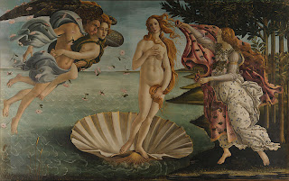
Formal Analysis of The Birth of Venus


Botticelli's The Birth of Venus
Image from Wiki Commons

The focal point of Botticelli’s The Birth of Venus is Venus herself, almost floating, in the center of the foreground with stark white skin; beams of light hitting her carefully painted curves. She is joined by Zephyrus, the wind God, his wife, Chloris, goddess of flowers, and the the nymph, Pomona, ready to receive Venus with a robe. Venus’ abnormally large proportions draw the eye of the viewer. With the curvature of her receivers, Venus is enclosed in an ovular shape, bringing unity to the piece. The expression on her face, as well as her pink hue, emphasise a youthfulness that reveals that she is emerging from the sea for the first time. To further her apparent modesty, Botticelli paints Venus covering herself with her arms and hair. The movement of Pomona’s garb depicts movement, as though she is running toward Venus to cover her and maintain her child-like modesty. Although Sephyrus is blowing the wind toward Venus, as if to beckon her, his robes blow in the opposite direction to further the importance of Venus’ arrival. Botticelli clearly uses line to his advantage in this piece. The implied line of the wind creates an overwhelming sense of movement. The detailed lines in Venus’ hair show her feminine structure. The background lay flat against the canvas, thus bringing all of the attention to the foreground. The most depth in the painting lies in the detailing of Venus’ body-- the definition in her stomach, face and hair. Another design element that Botticelli elegantly uses in this piece is color. The background is dark-- the sky looks as though a storm is coming; however, the foreground is brightened by a sun beam coming in from the right side of the painting, bringing a lightness and happiness to the painting. Botticelli’s The Birth of Venus illustrates articulate use line, color and expression.

Sunday, September 23, 2012

Principals of Design


Photo by Georgia Button 


The Ponte Vecchio, designed by Taddeo Gaddi, arches over Florence’s Arno River at its narrowest point. Initially, bridge storefronts were utilized by butchers; however, over time, and through natural deconstruction and reconstruction, it has become a treasure trove full of equal numbers of jewels and tourists. It is believed to have been built in Roman times and most recently reconstructed in 1345, making it the oldest bridge in Florence.

Unity and Variety: The mechanical aspect of the bridge is quite linear and rhythmic; it consists of three arches, the center arch slightly longer than its neighboring arches. The variety exists in the extended structures. The functional portion of the bridge is what maintains unity.

Balance: The Ponte Vecchio is unique in that it does not maintain the same symmetrical balance of Florence’s architecture that shares a similar date. What makes the Ponte Vecchio so unique is its protruding structures. Small storefronts extend out over the Arno River with no particular pattern. Sparsely placed, these structures make the bridge as a whole look unfinished, but beautiful in its unique off-balanced balance.

Emphasis and Focal Point: The varied colors of the protruding structures make them the focal point of the asymmetrical bridge.

Rhythm: The mechanical aspect of the bridge is quite linear and rhythmic; it consists of three arches, the center arch slightly longer than its neighboring arches. Fourteen windows are equally distanced from each other along the top.

Scale: The Ponte Vecchio is modest in its scale compared to other monuments of its time. Its size is naturally fitting to its surrounding buildings; however, its proportions seem out of balance...

Proportion: Proportions are unique to European style: modest and small portions extending out from a bridge barely wide enough for two cars to pass each other. Each storefront is so small that they are out of proportion with the rest of the larger tourist shopping areas surrounding the Ponte Vecchio.

Sunday, September 16, 2012

Elements of Art


Elements of Art: Shape/ Form
Masolino da Panicale, San Giuliano (c. 1420)
Luca Signorelli, Madonna and Child (c. 1490)


Masolino da Panicale and Luca Signorelli share a similar understanding of human form. In Panicale’s painting, San Giuliano, and Signorelli’s Madonna and child, they illustrate a comparable knowledge of shape and expression. Although they are both pieces created during the Renaissance, they date at c. 1420 and c. 1490; 70 years apart. They still hold strikingly similar shapes in regard to anatomy and angles. Both figures are painted at three quarter profiles and have bone structures that resemble each other. Panicale and Signorelli show the shapes of their subjects’ bodies underneath a heavy layer of clothing. Signorelli’s Madonna has a bulkier frame; her shape gives the impression of a sturdy woman. Conversly, Panicale’s San Giuliano has a more frail form, as he stands alone, centered, without strong footing. The shape of San Giuliano is also much more rigid, as a posing figure, whereas the Madonna is a fluid image almost captured in motion while playing with her Son. In these two works, the captured human form shows relationship, understanding of anatomy and emotion.